Isaac Bock — isaactbock@wustl.edu - 466249
Ege Çavuşoğlu — egecavusoglu@wustl.edu - 463866
David Yang — yang.david@wustl.edu - 451666
We are interested in visualizing live (weekly) traffic data within the NYC metro system in order to promote safe and socially distant travel. Using turnstile entry and exit counts, we display how busy each station tends to be throughout the day, and cross-reference this traffic with community-level COVID-19 data to estimate the risk of utilizing each NYC metro station.
Our project was inspired by a Georgia Tech visualization of crowd-based COVID-19 risks. Given current infection rates, even small groups of people are likely to contain positive cases, with high variability based on crowd size and location.
Although the Georgia Tech tool is effective at visualizing nation-wide trends, it lacks the specificity to shape local travel, which we wanted to expand upon and make more actionable for the general public.
Following the in-class bike station Leaflet.js studio, we decided that mapping NYC metro stations with live usage data and COVID-19 risk calculations could be an effective way to encourage this safer essential travel.
To calculate these COVID-19 risk statistics, we use the same simple statistical model as Georgia Tech to analyze crowd risks:
Our visualization is entirely public-oriented and designed to help people best minimize the risk of any essential travel throughout NYC. As such, users will be able to answer the following questions when evaluating their travel plans:
Although we initially considered providing data for MTA officials making decisions about station usage, this may disproportionately affect those who rely on stations for traveling to essential businesses and places of work. Thus, our visualization is intended solely for individuals who use the MTA system during the COVID-19 pandemic. Furthermore, any available information and data trends should only be used to provide support (e.g. distributing masks to high-risk and most-visited stations) rather than removing it.
Throughout the course of development, we also incorporated components to answer additional questions about safer travel alternatives, such as recommending nearby stations with less traffic. These additions are detailed within our design progressions below.
Raw data is processed within dataProcessing.js to aggregate daily and hourly station values. The raw data is too large to include in our web app bundle, so we also filter out nonessential fields to minimize the file size. This cleaned data is saved within metroHourly.json and metroDaily.json. Our cleaning process draws from Taming the MTA’s Unruly Turnstile Data, an article by Chris Whong that describes the initial data fields and how they can be simplified.
Although other visualizations do already exist for MTA metro usage, most focus on visualizing live train locations or travel at a city-wide level rather than station-specific safety metrics. Others only visualize data over a single day or week, and these alternative visualizations allowed us to identify general trends that could inform our own COVID-specific design.
Our visualization expands upon these prior visualizations by aggregating historical data over multiple periods of time (day, week, and year-to-date), while also displaying the current, most-recent data on map markers. Furthermore, we incorporate up-to-date NYC COVID-19 rates to make predictions about the risks of passing through each station. These design expansions can also be seen within our designs below.
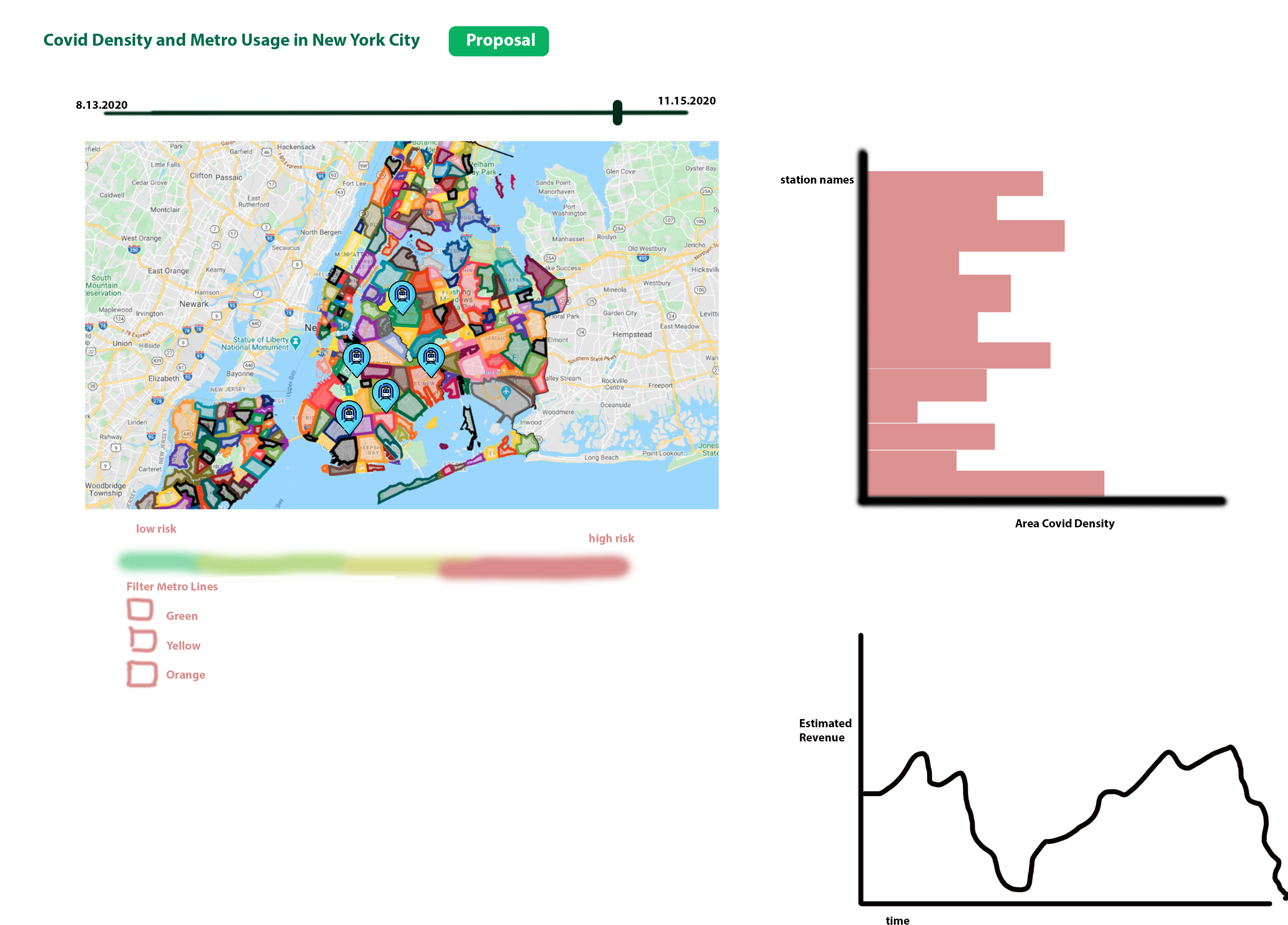
One visualization design incorporates a time slider to visualize both COVID data (via zip code overlays) and station activity data (via markers) over time. Users could filter and simplify results based on metro line, and revenue estimates would allow government officials and the general population to view any spikes or dips in overall usage.
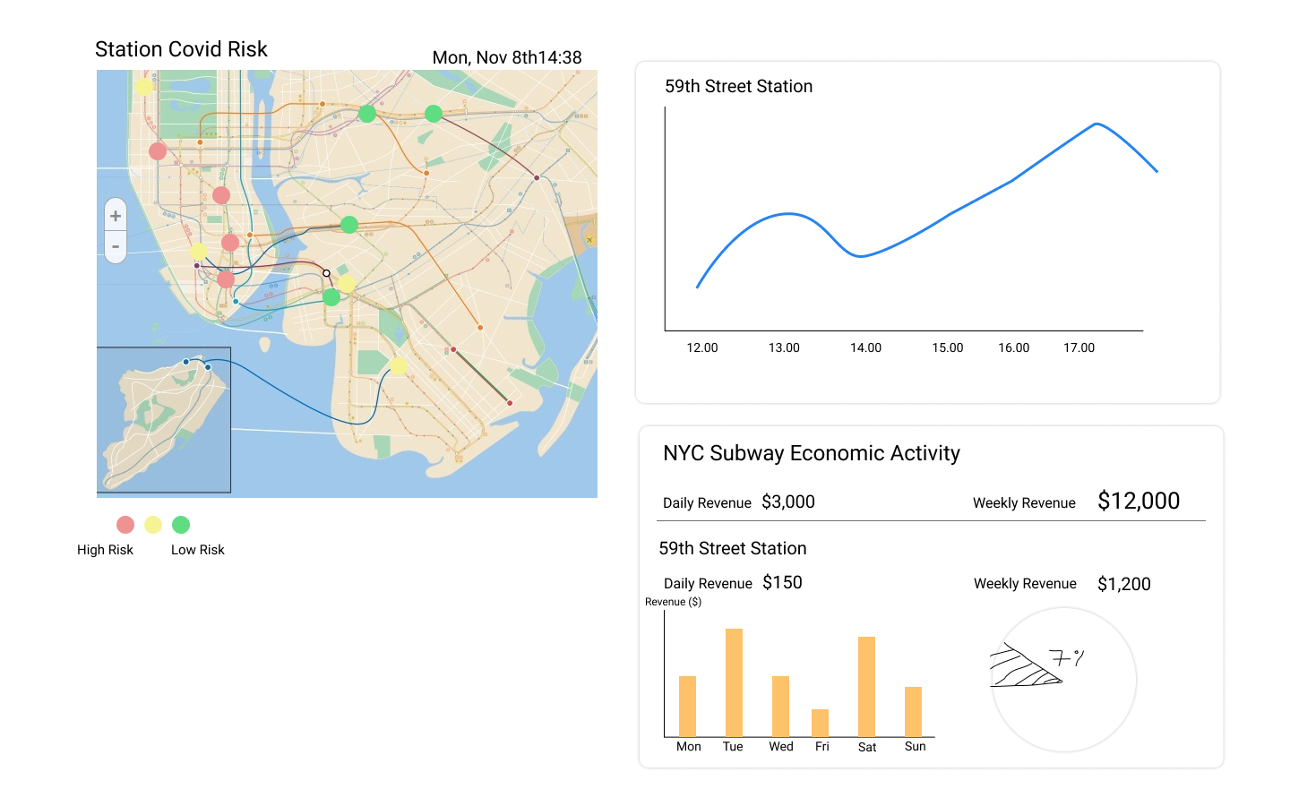
A second design localizes COVID risks to color-coded station markers, and provides a detailed view of historic station activity throughout the day. This would allow users to make informed decisions about their own future travel plans. A more detailed economic activity portion also includes the percentage of total passengers passing through each station, providing a bigger-picture overview of station activity.

A third visualization design utilizes a metro map rather than a geographical map to display activity and COVID risk at each metro station, and provides easily-visible activity and risk estimates. Utilizing a simple statistical equation provided by Georgia Tech (see Data Processing), users are also provided with specific COVID risk details for differing crowd-sizes.
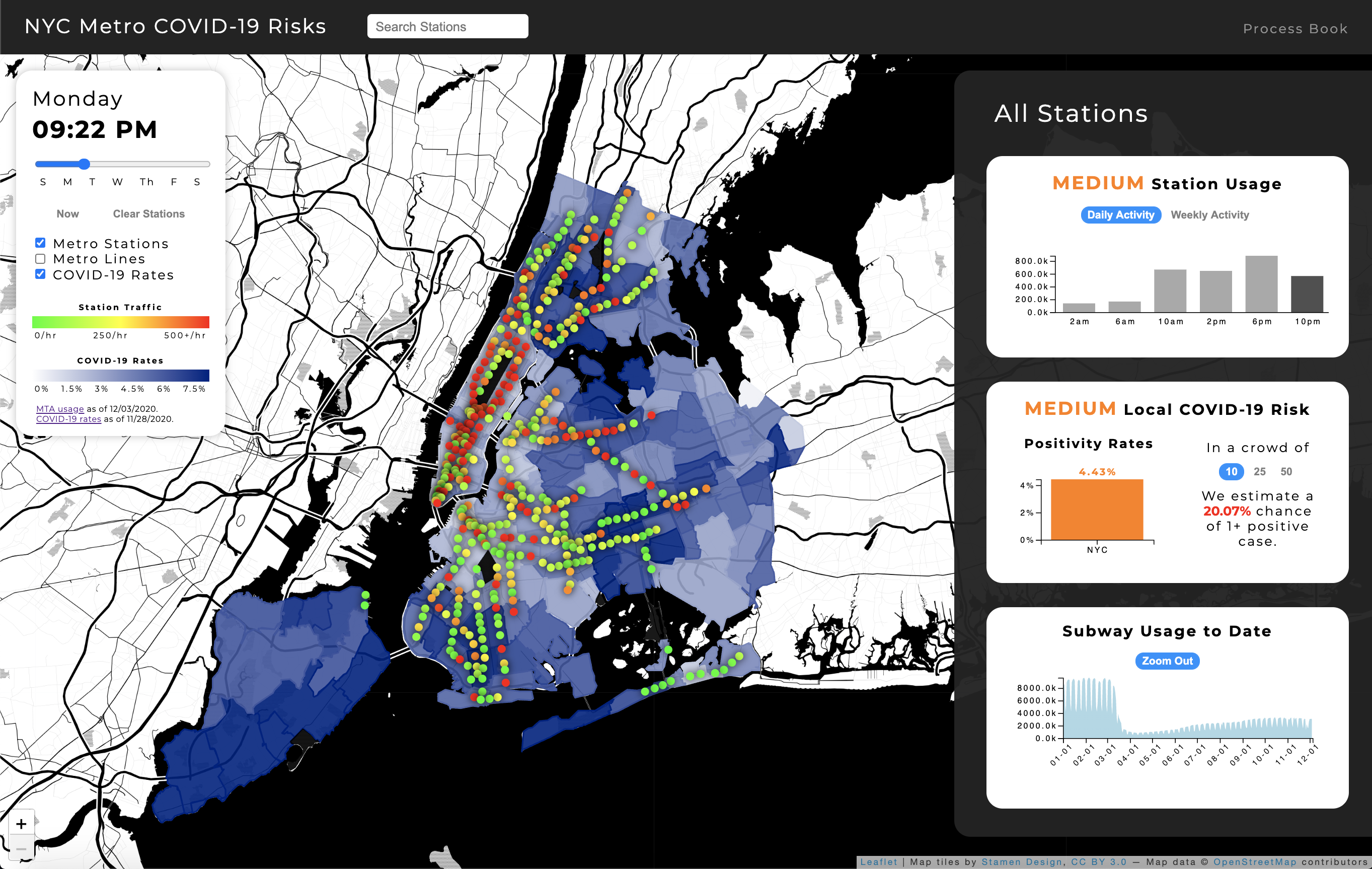
Our final design incorporates the best features of all of our preliminary designs. It includes a geographical map of stations, which will allow users to easily find stations near their current location. Color-coded markers and map overlays will provide details about local COVID rates and live activity. Interaction with station markers will provide information about hourly and daily traffic, allowing users to utilize less densely-populated travel times. A COVID-19 risk portion will provide detailed information about the risks of traveling through each specific station. An year-to-date visualization will display economic and traffic distribution trends, providing a larger-scale overview of travel and economic ramifications of the pandemic. Selecting multiple stations will display averages of the data, allowing users to test out different potential routes to find the safest option.
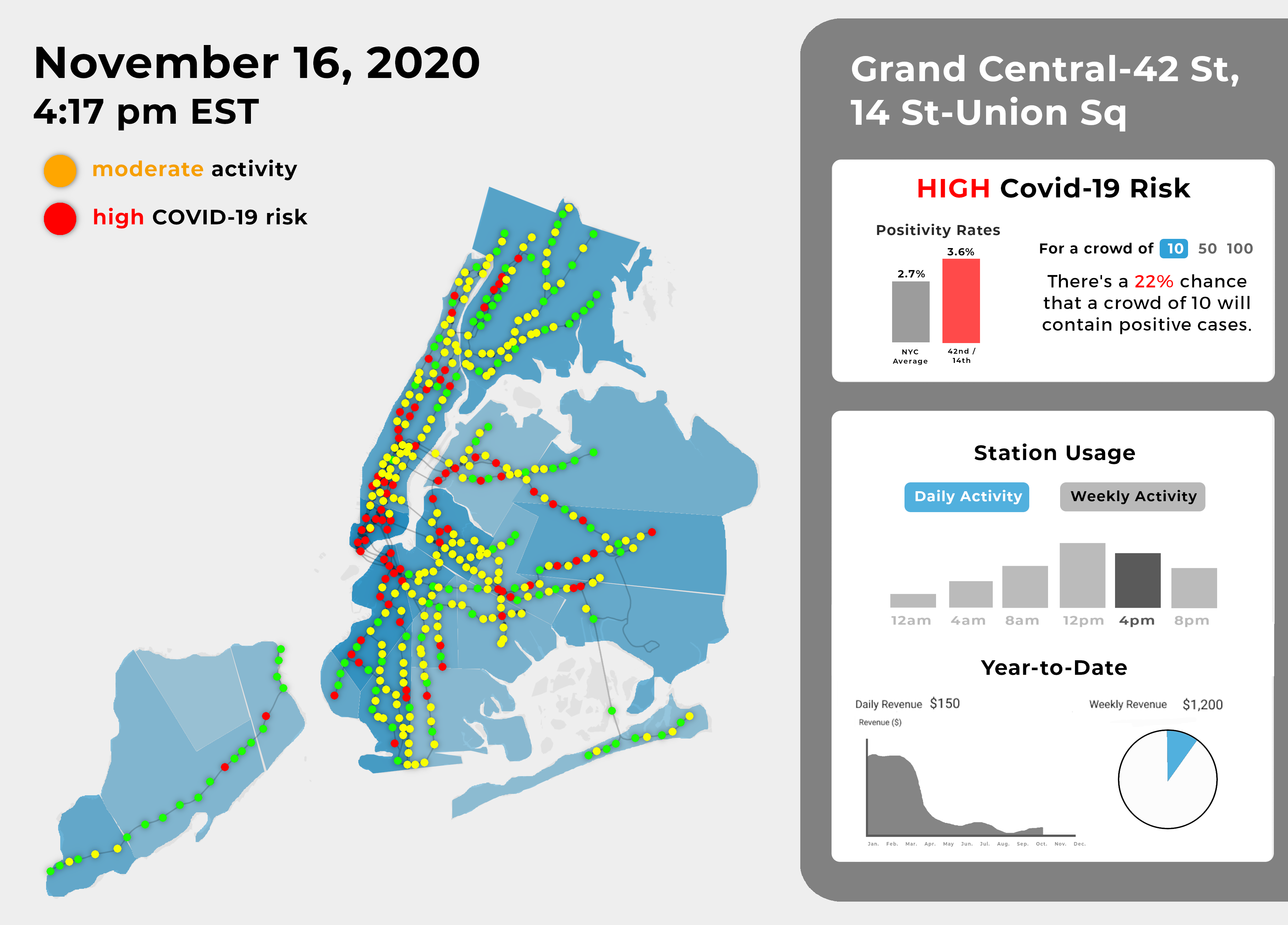
Our first milestone replicates our final preliminary design with a few slight modifications. First, it eliminates any direct visualization of economic activity in an effort to dissuade MTA closure of stations essential to the public. It also eliminates any direct statements of overall activity (such as “moderate activity”, which could be misleading to the public. Within our visualization, there is a large range of station activities, so this broad generalization could be dangerous. Our first milestone also adds a few interactive components, and still requires additional completion and refinement of station activity charts for the next milestone.
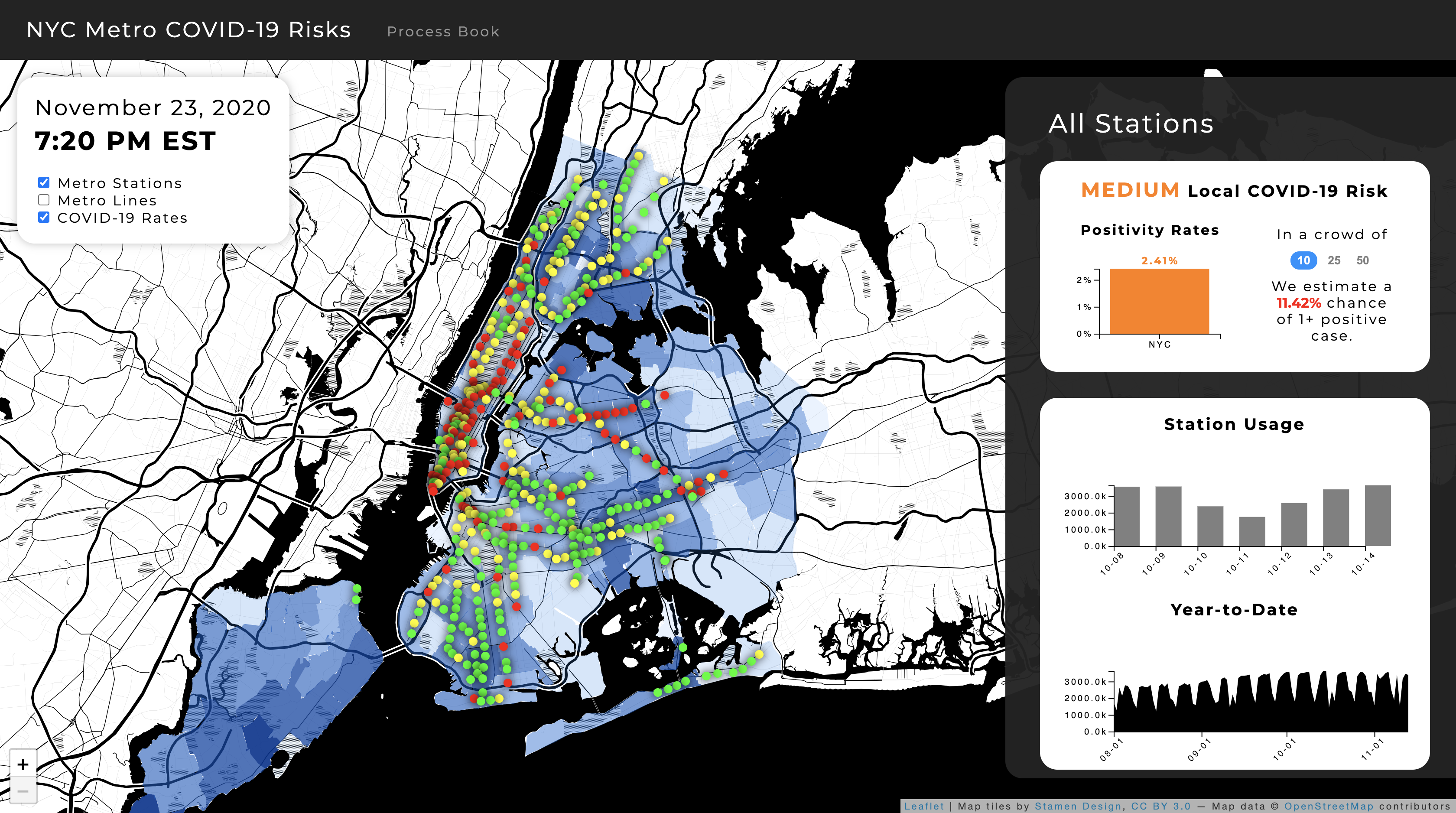
Our second milestone adds many new interactive and descriptive components to improve user experience. We incorporated a loading screen that provides users with a quick instructional overview and map legends to interpret our color schemes. Furthermore, we added an interactive time slider to visualize data throughout a typical week and aid in travel planning. This slider filters the entire visualization and its data appropriately. We also added a second usage chart to display hourly data trends in addition to daily patterns. Given this additional nuance in displaying and filtering data, we can more safely reincorporate comparative markers of station usage, such as "Medium Station Usage". When selecting stations, users are also provided with nearby recommendations of safer alternative stations. Finally, a search bar allows users to more easily find and select stations of interest.
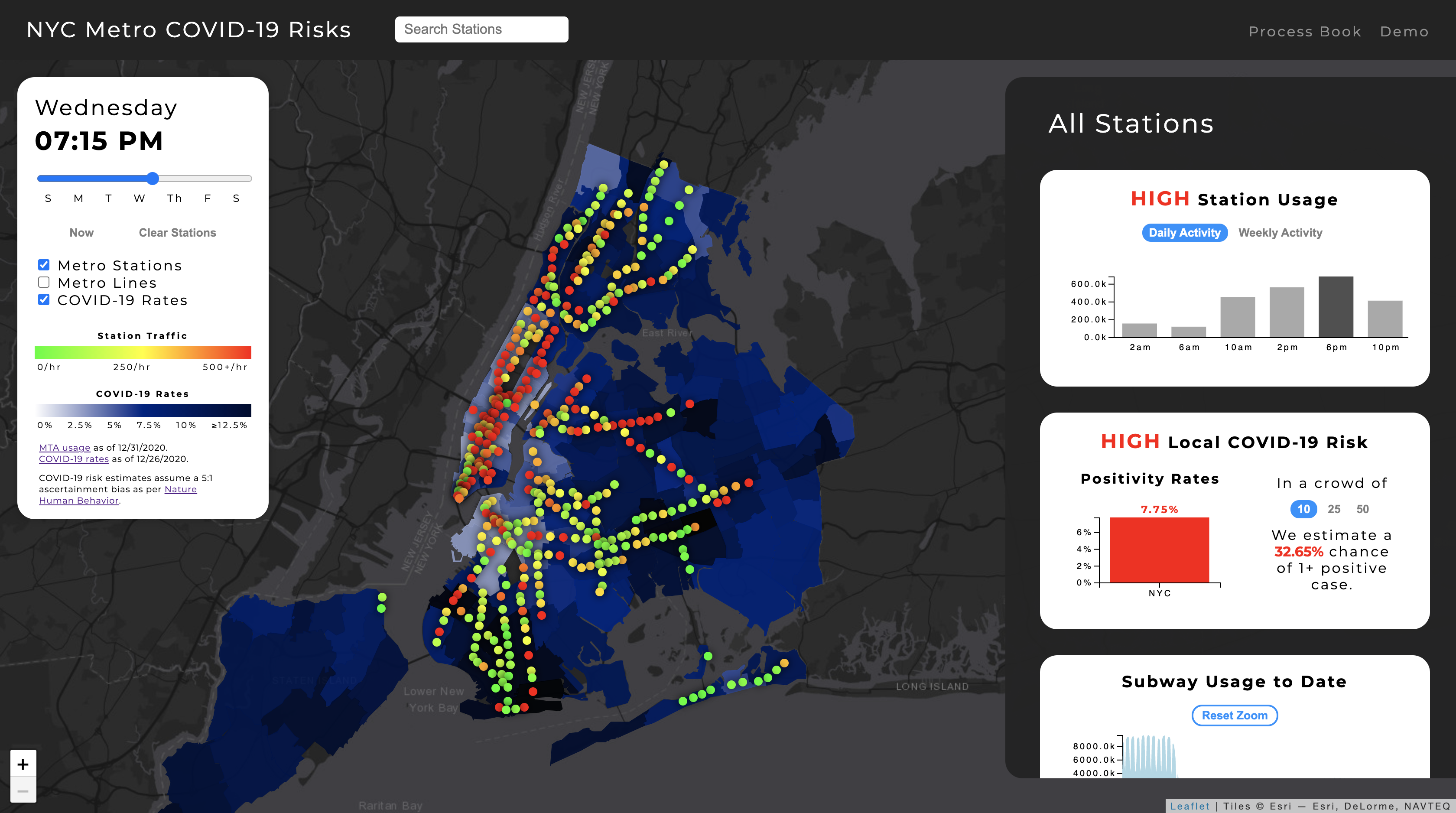
Our final design utilizes a less-distracting map background, a slightly wider time slider, and selected stations with greater size and contrast following peer and instructor feedback. We also added more interaction to station recommendations, which now reveal alternative locations on hover and can be swapped in on click. Finally, users can now click on bars within the usage charts as a second intuitive way to update the current visualization time.
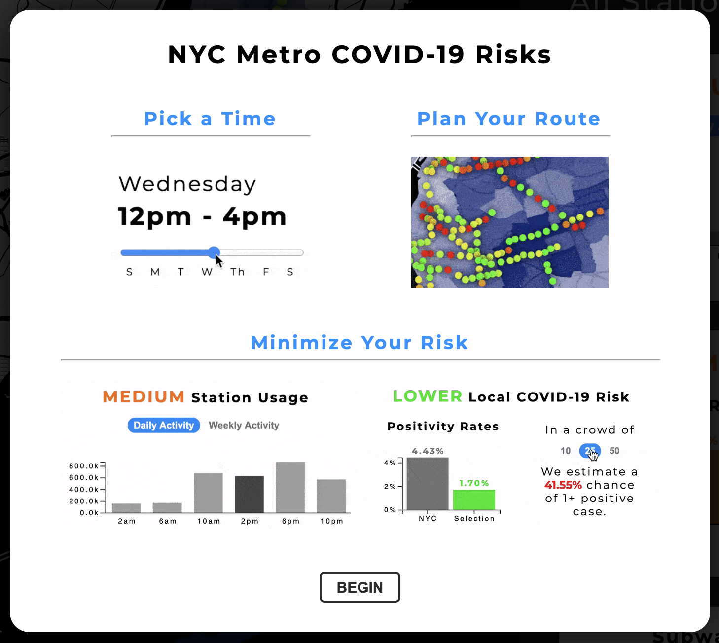
While data loads, we present users with a brief animated breakdown of our visualization to show its capabilities and interactive components.
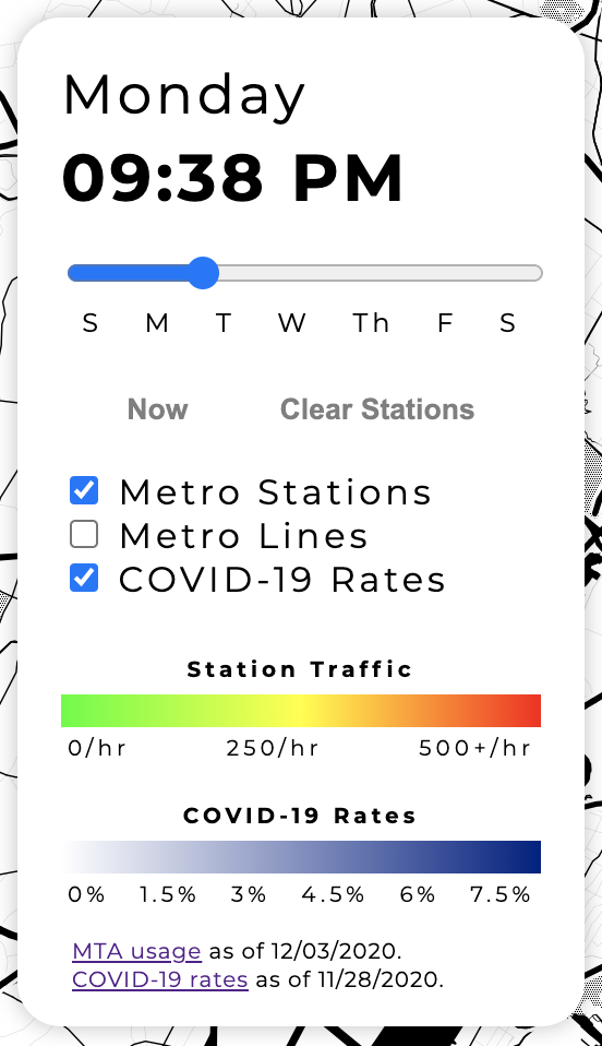
The user can see the current local time in NYC, interact with a slider to visualize data throughout the week, and select options for manipulating the map visualization.
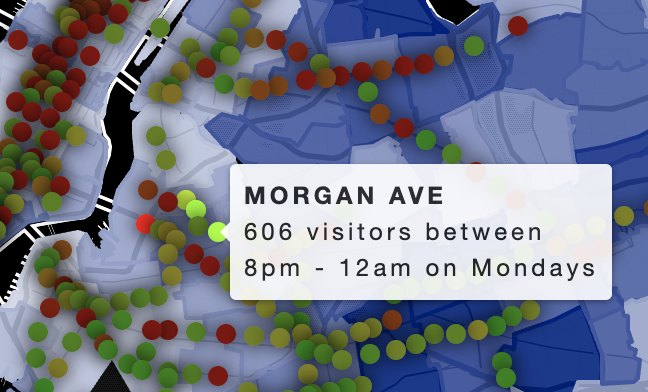
Colored markers indicate stations and their daily activity, while blue map backgrounds indicate local COVID-19 rates via saturation. The map is created with Leaflet.js to be mobile-responsive, and hovering over a station reveals more detailed information (name & usage details) within a popup. Furthermore, users can click stations to select them (which desaturates all unselected stations for contrast) and filter the data for other visualization components.
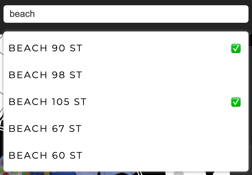
Users can search for and select stations by name rather than geographic location. Previously selected stations are indicated with a checkmark.
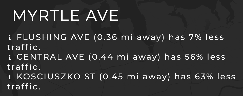
We automatically recommend nearby stations (within 0.5 miles) that currently have less traffic than selected stations in an effort to promote socially-distant travel.
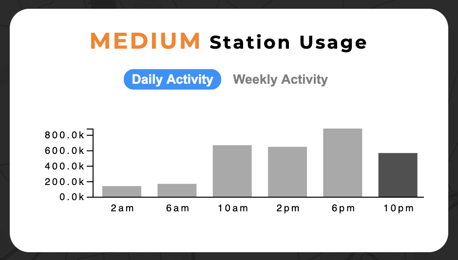
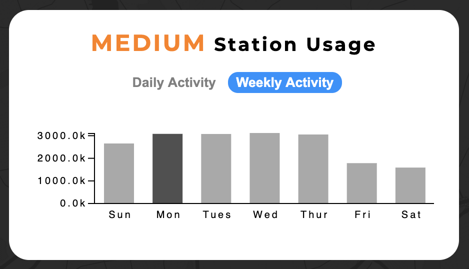
Users can see station activity throughout both a typical day and week to help make informed decisions about when to travel. The current day and time are indicated with darkened bars, and tooltips appear on hover to provide specific numerical values regarding station passenger counts.
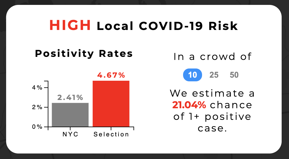
Users can quickly see whether areas of interest are COVID-19 hotspots, and compare their selected stations to the city-wide average as a reference point. Furthermore, to help make sense of these numbers, we provide a risk estimate for three different crowd sizes (5, 25, and 50 people) to show how quickly personal risk can grow in public settings.
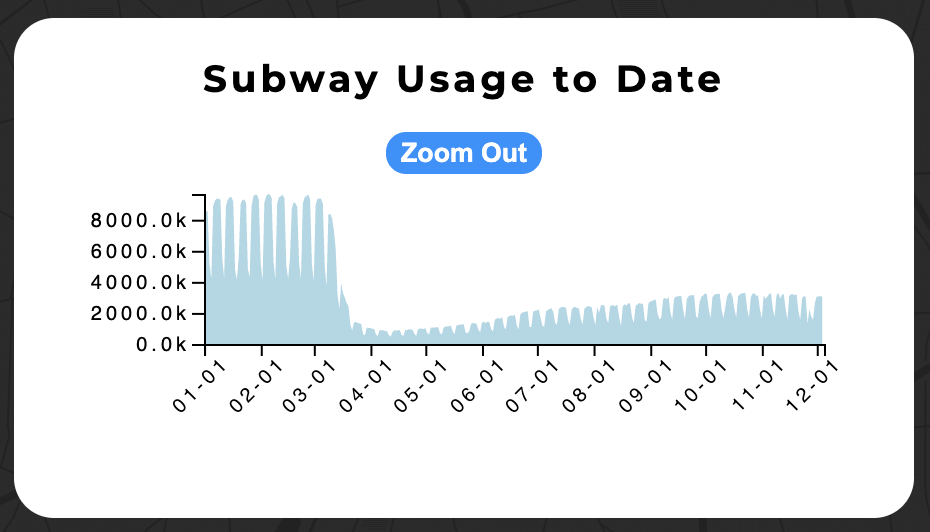
A usage-to-date visualization shows a bigger picture view of transit during the pandemic. As our visualization continues to update with recent data, this could reveal different waves of infection and lockdown. Hovering highlights and displays passenger count information for one week at a time, and users can zoom in on the area chart to explore the data.
Our visualization allows users to quickly view the status of metro transit and COVID-19 for NYC as a whole, and then refine the data to best match and inform their own personal travel plans. As such, users can answer all of the original questions we posed:
Our visualization could be further improved by incorporating a routing API to find the safest route between two points. In this way, the planning process would be further streamlined for users, and could incorporate additional information about specific timings of metro trains and the lines they operate on. However, this is currently beyond the scope of our project and would require additional time and resources to implement effectively.